
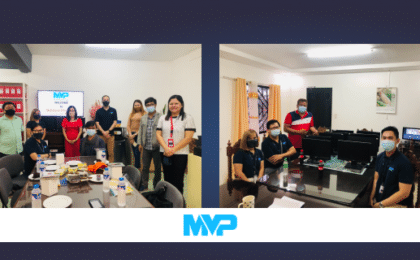
Basic Web Design Principles
| June 24, 2018
More than 81% of consumers conduct online research before making a major purchase.
This puts websites in a position of incredible influence. That is of course, if they’re well designed.
The best web design strategies are quite difficult to pin down but the basic web design principles are here so you can grade your site’s effectiveness.
According to Adobe, 59% of consumers prefer aesthetics over simplicity and efficiency when it comes to web content. But the same data also shows that 41% of consumers stop viewing a page altogether, if it takes too long to load. In fact, each additional second of load time, after 2.4 seconds, results in an additive 6% drop in viewership according to Soasta’s data.
This paradox in the desire of most consumers is the reason why MVP’s basic web design principles are divided into two categories: Aesthetics and Functionality.
This division in the principles of web design is necessary in formulating the most suitable web design checklist for a particular website. A catch-all strategy is almost certainly doomed to failure due to the varying needs and desires of each consumer. To this extent, to design a compelling website is to employ demographics in mixing and matching the principles in these two categories:
Aesthetics
1) Composition and Spacing
As a subcategory of visual art, web design shares some of the aesthetic rules of photography and film. For example, compositional techniques like the Rule of Thirds or the Golden Ratio can be applied to the elements of a website.
The Rule of Thirds is perfect for professional websites, giving them a symmetrical and structured look, while highlighting their points of interest. The Golden Ratio on the other hand, is great for websites that want to go for a more natural panoramic look.
The use of negative space is another method of achieving visually pleasing designs. While it seems efficient to make full use of the space in a website, 41% of consumers click away from a website that contains lengthy text. Instead of oversaturating a website with content, it’s best to contrast, clear but concise content with negative space; giving it an elegant and relaxed look.
2) Typography
Web content is mostly composed of text, and yet typography is usually underappreciated and underutilized in web design.
Being creative with typefaces can add a layer of polish to websites. However, there’s also the risk of overdesigning. Which is why it’s important to remember that the goal of typography is to enhance the reading experience of the user, and not drawing attention to the type itself.
In terms of choosing the right typeface, the text must be given the main priority, with the typeface supporting the text and not the other the way around.
Another factor to consider is the compatibility of certain typefaces. Fonts with widely differing character widths should not be used together. Bad typeface combinations result in fonts fighting for attention. Even compatible fonts should be used sparingly, and it’s a general rule of thumb to minimize the number of fonts used.
Finally, readability can be greatly improved by setting the line length of the text to 50-60 characters per line for desktops, and 30-40 characters per line for mobile devices.
3) Light and Shadow
Minimalist designs that primarily use light and shadow have the advantage of not taxing page speeds as much as regular designs do. Unfortunately, the lack of detail in this art style can lead to misconceptions and misinterpretations.
Sufficient understanding of Gestalt theory enables designers to cut through the ambiguity of minimalist designs and subsequently utilize light and shadow to their maximum potential.
Gestalt theory is a study on the human mind’s methods of acquiring meaning from vague and chaotic visual cues. By understanding the perceptual tendencies of the human mind, you will be able to craft an image that will be perceived in the exact way that you want it to.
For example, it’s possible to leverage your understanding of the law of closure to create a design that’s technically incomplete and yet easily comprehensible. Or using the figure-ground concept to combine two designs into one, consequently improving the page speed of the website.
4) Color
Color is a website element that’s easy to overlook when done right but immediately calls attention to itself when applied incorrectly.
Brushing up on which colors complement each other can help a web designer in creating a sense of balance and harmony. Sometimes though, breaking that meticulously crafted harmony is the correct design decision to make.
Contrast is an invaluable tool for any artist, and a contrasting vibrant color can draw attention to call to action statements/buttons.
Functionality
1) Visual Hierarchy
Processing visual information isn’t as effortless as it seems. Web designers should exhaust all options when it comes to making their design easier to perceive.
Good design guides the eye of the viewer in a pattern that mimics the natural movement of the human eye; all while presenting information that’s arranged according to significance.
The two most prominent layout designs in web development are the F-Pattern and the Z-Pattern. However, these design patterns essentially follow the same principle, in which the human eye scans a page from left to right, and then from top to bottom.
2) Information Architecture
Users visit websites with certain goals in mind. It’s the responsibility of the web designer to ensure that users find what they’re looking for in a timely manner.
To do this, the information architecture of the website must be based on the navigation path that users will most likely take. And accurately predicting how users navigate the website requires a deep understanding of your target demographic.
It’s also important to remember that efficient organization becomes ineffective in the face of terrible labels. Content must be labelled in a clear and comprehensive manner so that users know exactly where they are, what they’ve found, and what to expect from the surrounding links.
3) Simplicity and Efficiency
Sometimes adding all the bells and whistles can be detrimental to the effectiveness of a website. According to Hick’s Law, increasing the number of available choices also increases the time it takes for a person to reach a decision.
So a feature-packed website is not just slower in terms of page speed, it also eats more of a user’s time. And since users only linger on web pages for a limited period of time, a complex and feature-packed design is likely to reduce the conversion rate of a website.
In fact, just one second of added load time can result in a sales drop of up to 27%.
There are ways to improve the efficiency of a website despite all its frills. Images for example can be optimized in terms of size and scale. Converting the file type of simple images to vector graphics can also potentially shrink their size.
Lastly, using a central CSS reduces HTTP requests and consequently speeds up the load time of pages.
4) Consistency
In a world where 83% of people use two devices at the same time when consuming online content, consistency is king.
There was a time when web designers only had to worry about the consistency of their web content in terms of varying web browsers. But with smartphones and tablets now dominating 60% of all digital content viewership, web content must now remain consistent across a wide range of devices.
Inconsistency in content display, results in a potential 80% reduction in viewership. This is why a responsive layout for mobile devices is definitely worth the additional resources needed to make it work.


